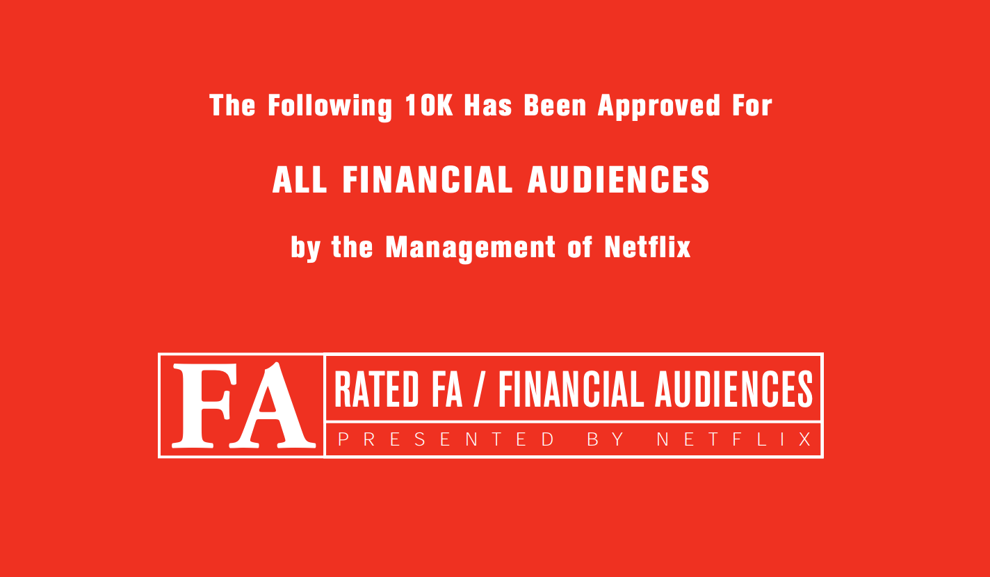
Annual reports are part and parcel of every public company’s life. It is a document that the public corporations must provide annually to shareholders that describes their operations and financial conditions. In the U.S., companies typically file the Form 10-K with the Securities and Exchange Commission (SEC). One fine day, as I was following the internet rathole, I landed myself on the Netflix investor page for some reason. One thing to understand about these 10-K forms is that these are …. pretty basic. Imagine being transported back in time from the current beautifully designed web interfaces back to a text-based interface. This is what I was dealing with, and all the reports looked like these fine specimens from Facebook and Amazon.
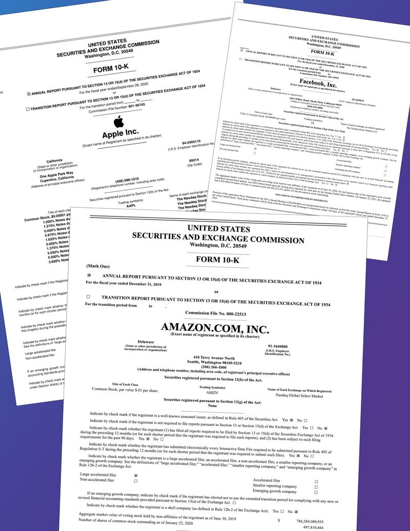
Facebook and Amazon 10-K Annual Report filings
Then 2002 happened!

I landed on an Annual Report unlike any I had seen before. And it was not just the 2002 Annual Report - the reports from 2003, 2004, 2005, 2006 were similar! Somebody had actually put a lot of time into designing these ‼️
Here are my favorite examples.
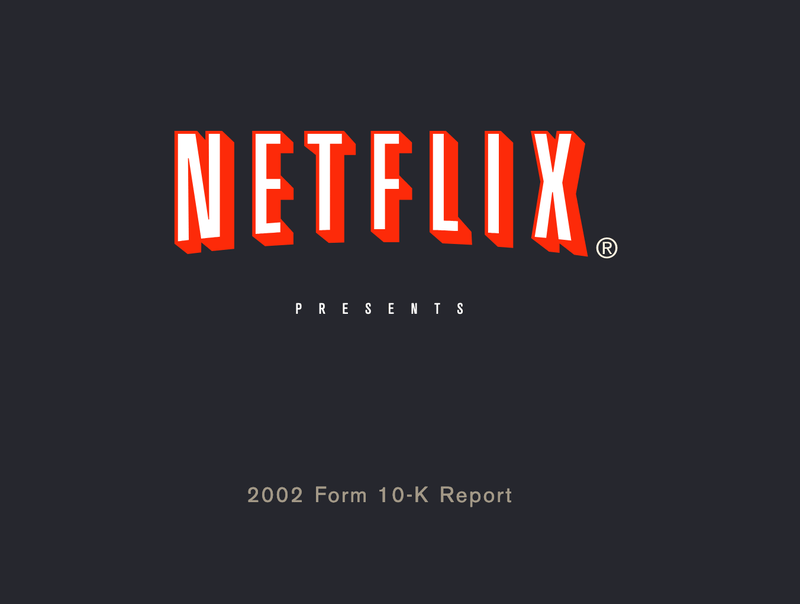
2002
What I love about this report is the play on introducing the report as an opening sequence of a movie.
2003
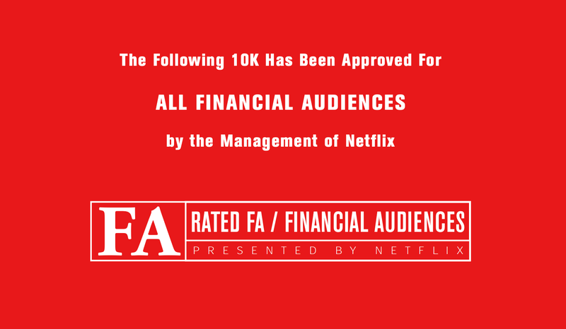
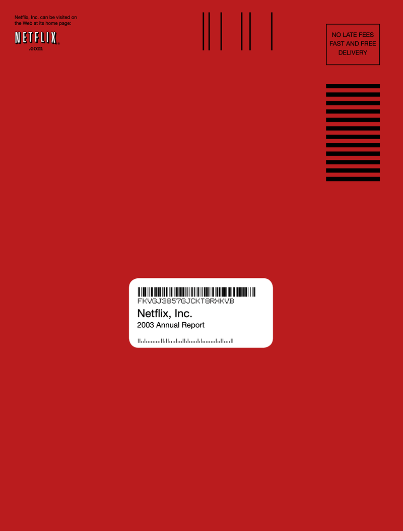
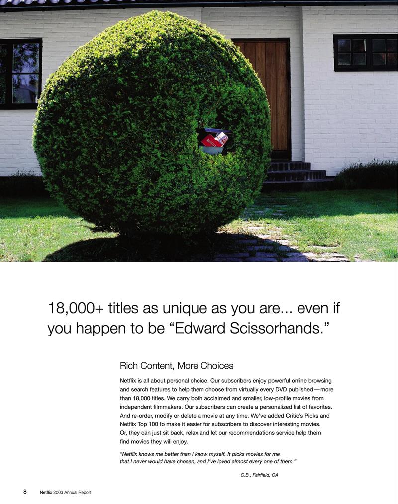
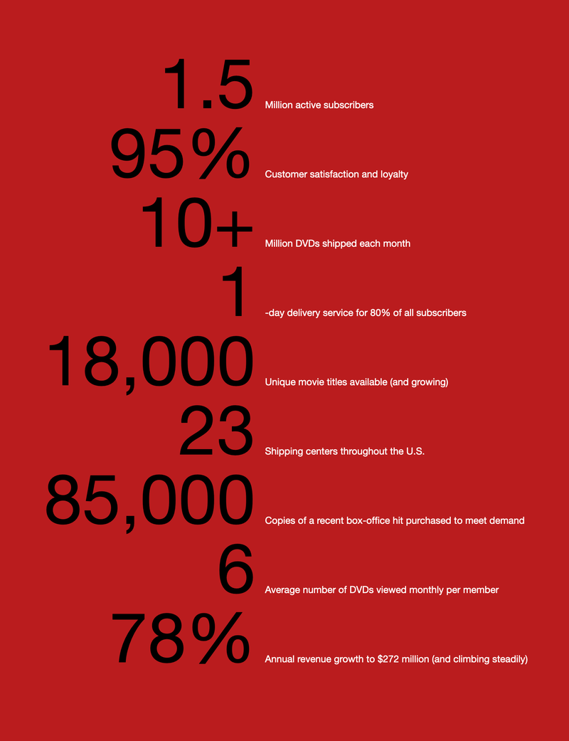
2003 report begins with a Netflix-DVD-in-the-mail envelope design - very on-brand! It then plays on movie titles like Edward Scissorhands to explain benefits and features. Then, it ends with an infographic that makes it very easy to digest the annual numbers.
2004
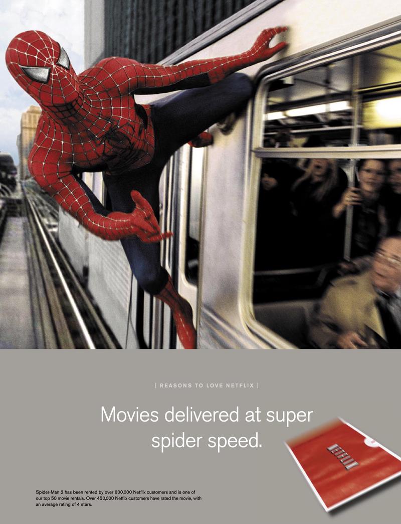
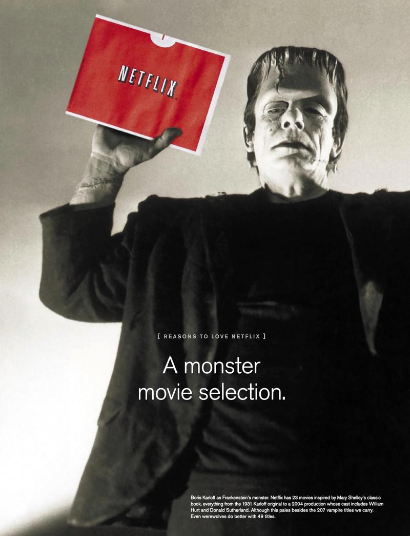
The 2004 report continues the tradition of a grand opening. It then uses direct integrations with famous movie characters like Spiderman, Austin Powers, and Frankenstein. This is my favorite report!


2005
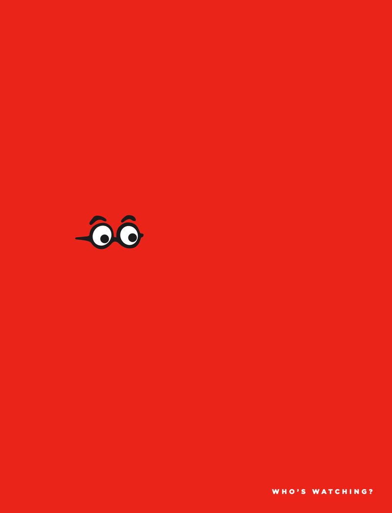
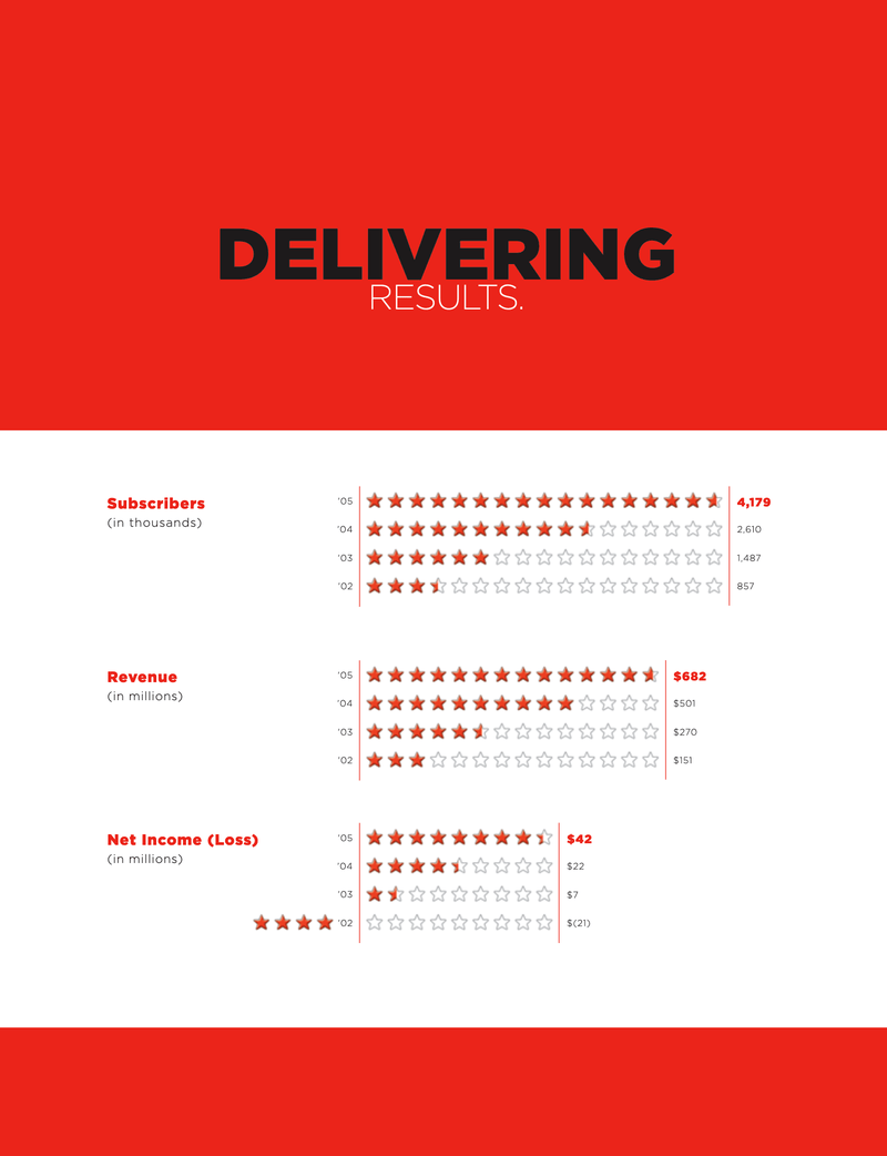
For the 2005 report, the focus seems to have been on the subscribers. I’m not sure if the profile pics are of the subscribers to Netflix at the time, but it’s very likely. The now-defunct star-based rating system shows up as a way to represent horizontal bar charts. Somebody really put some serious thought into this design!

2006
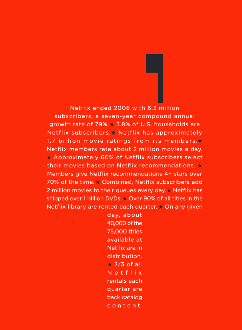
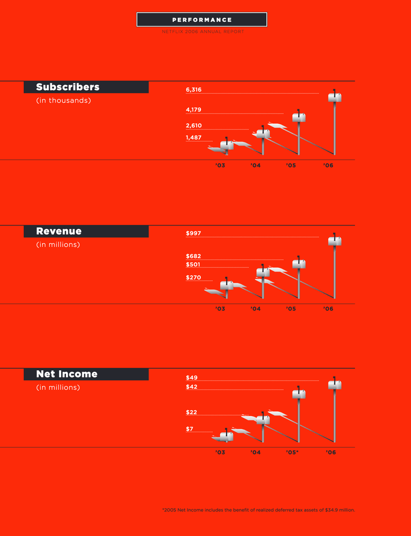
2006 is the first year when the design was toned down and only a couple of pages worth calling out. This report’s theme seems to be the mailbox and a mailbox bar chart that I can only describe as “atrocious.” What are they trying to do with the shadows? 🧐👀
2007, 2008, 2009
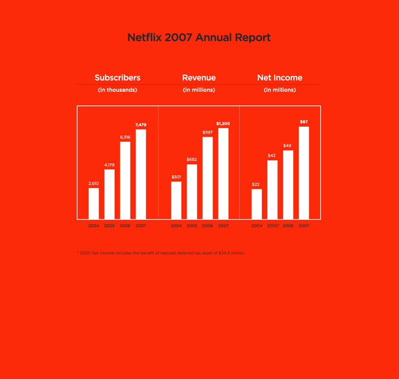
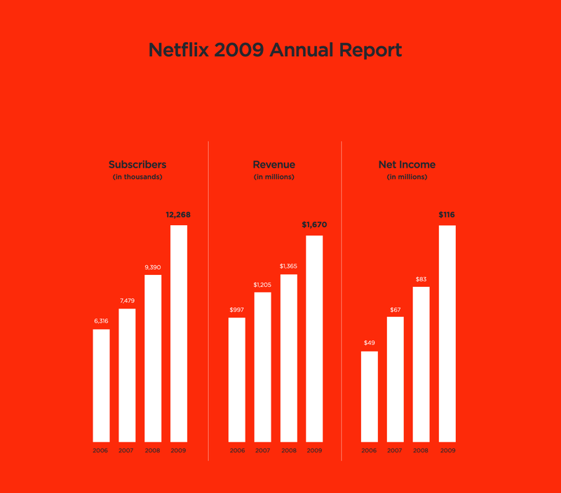
2007, 2008, and 2009 are basically clones of each other. The design has been reduced to bare bones with only a couple of “designed” pages before the 10-K form. There are only a few pages worth calling out, but at least the bar charts are sensible and easily readable. 🎉
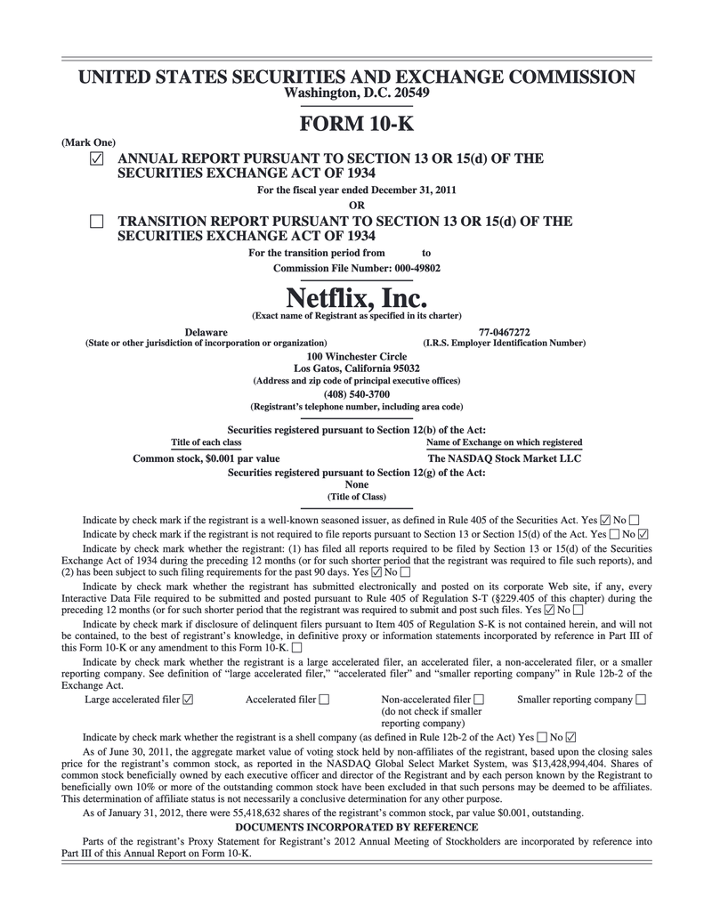
2010-Present Year
From 2010 onwards, we’re basically back to the SEC template without any “designed” pages. Not sure what happened to the design team in 2010. 🤷
If anybody knows the answer, please reach out.
Link to all Netflix Annual Reports
Contact
Reach out if you have any questions! Feel free to follow me on
- Twitter - @singhkays
- LinkedIn - https://www.linkedin.com/in/singhkays/
