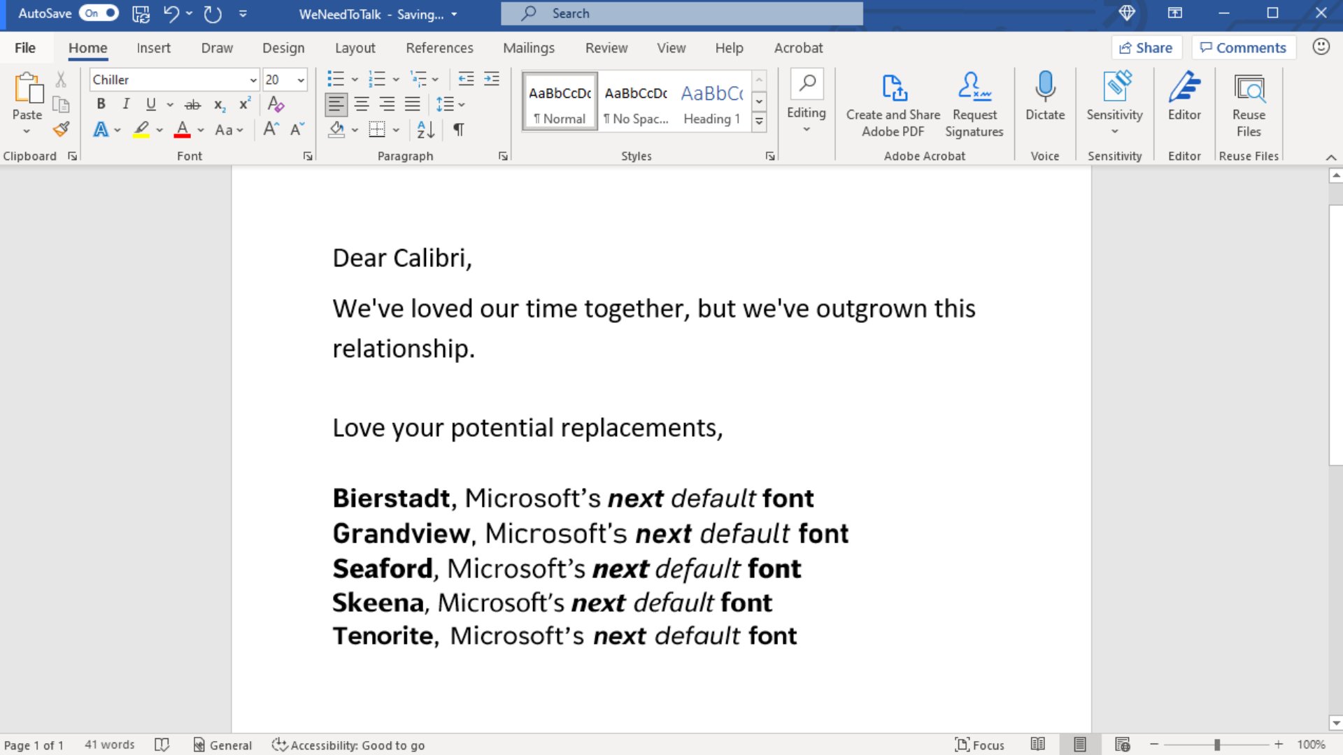
Calibri has been the workhorse for Microsoft Office apps since 2007 when it stepped in to replace Times New Roman. Personally, I’ve long since moved past Calibri and have started messing with Inter and iA Writer Duospace lately.
We need to talk. What should our next default font be? pic.twitter.com/fV9thfdAr4
— Microsoft (@Microsoft) April 28, 2021
I’ve always been a fan of good typography, so of course, I was going to take Calibri’s replacements for a spin after reading that tweet!
2007 A.D.
My next thought was about what the world was like back in 2007. Here are just a few of the highlights:
- Netflix had just launched its streaming business
- Apple launched the first iPhone
- Facebook had only opened up to everybody outside of universities at the end of 2006
- Twitter was 6-months old, and the 2007 South by Southwest Interactive (SWSWi) was the tipping point for its popularity
- MySpace had nearly 300 million registered users, Google signed a deal worth $900 million to sell ads on MySpace and people were valuing MySpace at $65 billion!
- Amazon launched Kindle
- One of the best TV series — The Sopranos — ended while another — Mad Men — premiered
- The “I Can Has Cheezburger” meme was published, thereby sparking the internet’s infatuation with cats
14 years is a long time that Calibri has been terrorizing decorating documents and emails. Talk about longevity!
Testing Setup
Here’s how I tested:
- Light mode in Microsoft Word
- Dark mode in Microsoft OneNote
- Both applications running on Mac OS Big Sur
- 1920x1080p resolution
- Heading 1: font size 16
- Heading 2: font size 13
- Heading 3, Body, Quote: font size 12
- Subtitle: font size 11
- Word zoom: 130%, OneNote zoom: 100%
Contenders
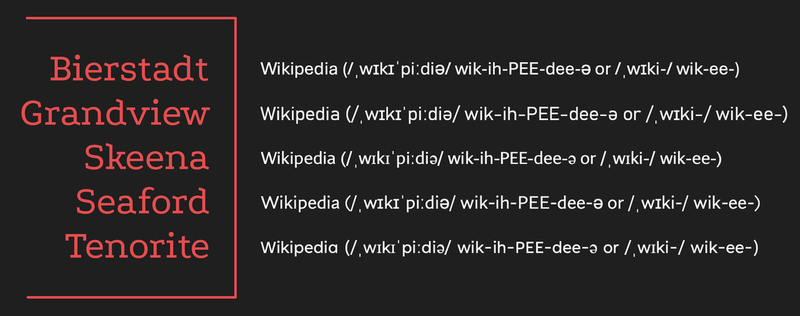
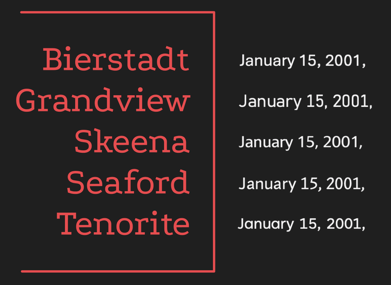
- Bierstadt
- Grandview
- Seaford
- Skeena
- Tenorite
And some oldies for reference
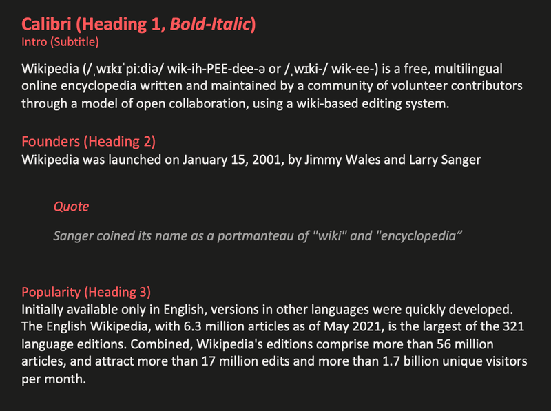
- Calibri
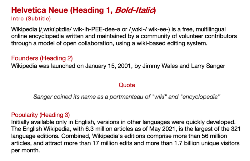
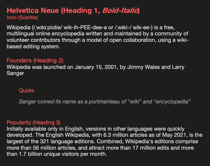
- Helvetica Neue
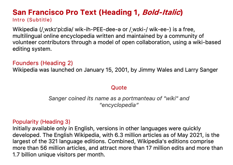
- San Francisco Pro Text
Results
To add background about the fonts, I’ll be quoting the designer’s commentary from Microsoft’s announcement blog.
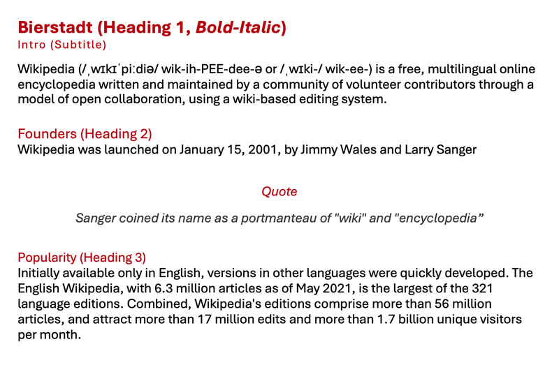
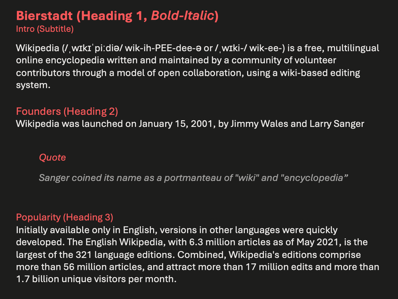
BIERSTADT by Steve Matteson
Steve: Microsoft had requested a new typeface in the “grotesque sans serif” genre, a style defined by block-style letters without calligraphic flourish or contrast between thick and thin strokes. Helvetica, created by Switzerland’s Haas Type Foundry in 1957, is the most famed example.
Swiss typographers gravitated to grotesque designs like Helvetica because of their suitability for grid-based typography. In today’s world, I believe a grotesque typeface’s voice needs a bit of a human touch to feel more approachable and less institutional. Bierstadt’s systematic design contains organic touches to help humanize digital environments and soften the regimented order of grid typography.
Microsoft already has Arial—which has many attributes from grotesque types preceding Helvetica—and my approach was to design a sans serif which would contrast with Arial by being far more mechanical and rationalized. The terminal endings are precisely sheared at 90 degrees—a modern note contrasting the softer, angled endings in Arial—and a lack of somewhat fussy curves found in Arial’s ‘a’, ‘f’, ‘y’ and ‘r’.
As for the name, Bierstadt is named for one of Colorado’s 14,000 ft peaks. When I think of Swiss type, I think of the Alps, and since I’m based in Boulder, my Alps are the Rockies.
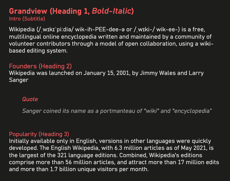
GRANDVIEW by Aaron Bell
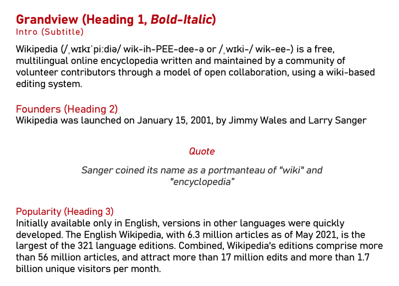
Aaron: When I was first asked to create a font that retained the spirit and personality of the German Industrial Standard (DIN) and was more readable for body text, I wasn’t sure it was possible.
Typefaces for body text need to encourage the eye horizontally across longer lines of text, but DIN was intended for high legibility in short runs of text in medium to narrow spaces. So, I was concerned that by trying to force the Grandview design to become more text-centric, it would no longer retain the same feeling.
Using Bahnschrift—a prototype I developed in the mechanical style of DIN—as a starting point, I decided to keep the x-height large. This results in better legibility and readability at smaller sizes on low-resolution devices, which matters because Grandview is intended for body text on any computer running Windows. Then, I created a version about 20 percent wider than the original design and interpolated between them to find the exact right balance between Bahnschrift-ness and the horizontal aspect. Ultimately, I found increasing the width of the lowercase by 40 units (four to five percent) was perfect. The width of the uppercase was also increased by about 20 units (roughly two percent) to keep them in step with the lowercase.
The resulting design, Grandview, preserves the voice oftheoriginal and works exceptionally well for long-form text settings. I’m excited to see how the community engages with it, particularly because the mechanical style of DIN is popular across a wide range of design implementations, from data visibility and gaming to document settings. I can’t wait!
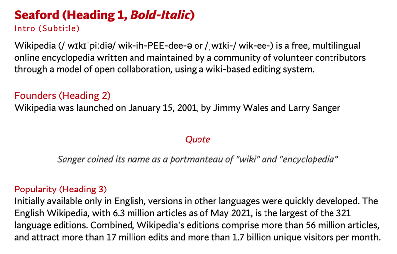
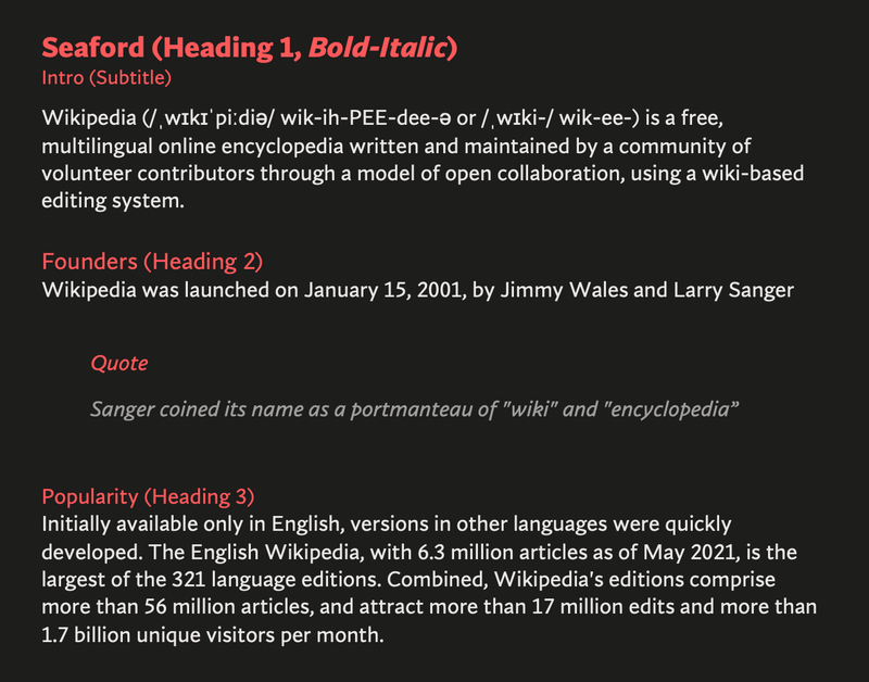
SEAFORD by Tobias Frere-Jones, Nina Stössinger, and Fred Shallcrass
Tobias: At the start there was just a broad description of a personality—comfortable, warm, inviting, animated—so we began by studying the overall movement of old-style serifed faces. We hoped to create the same, familiar kind of warmth, but without the serifs.
We didn’t want to be too literal about these references, but many of their themes loosely guided our work, such as a preference for differentiation of shapes over repetition and symmetry. And since most of the running text is set in lowercase, the earliest drafts focused on the lowercase branches, bowls, and terminals, tracking how those elements would relate across the various styles.
Nina: To pinpoint the kind of familiarity and “comfort” the typeface should evoke, we also looked at pictures of old armchairs: in chair terms, we were going for a practical interpretation of a beautiful family heirloom; durable upholstery, nothing overtly plushy or nostalgic. And when it comes to italics, it turns out there are parallels between chair ergonomics and typography: rather than inflating it and making it softer, trust the rigid moments that are good for your back.
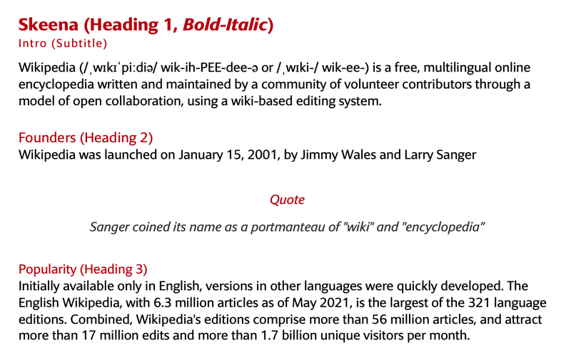
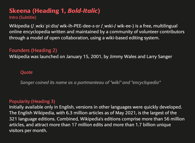
SKEENA by John Hudson and Paul Hanslow
John: Skeena is a fresh take on sans serif, a genre that has been dominated in the past decade by neo-grotesques and geometrics. We wanted to create a humanist sans serif with generous proportions and a higher than usual stroke contrast (also known as the variation in weight between thick and thin parts of the letter). Paul introduced diagonally sheared terminals to enhance Skeena’s distinctiveness, and I added the curving of entry and exit strokes in letters like ‘n’ and ‘a.’
Because Microsoft wanted us to design for both text and display fonts, I decided we should use the latter to push the stroke contrast further. The display fonts, used at larger sizes, while clearly related to the text fonts, have a more dramatic impact.
Paul: I find a typeface begins as either a mental picture that takes a visual form or an abstract idea that is given life by constantly assessing its forms against the abstract idea. Skeena began in my mind as the latter and fleshing it out required continual assessment to ensure my original idea was being reflected in the typeface’s forms.
Because the ask for a humanist sans was fairly open, I wanted to cherry-pick from multiple typographic periods and force them to work together. I chose elements that I found challenging to appreciate aesthetically; for example, I like high contrast san serifs. These can be unsightly and too brittle to work effectively at small sizes in digital environments, which is why they tend to be associated with luxury branding and opulence.
I’m proud that Skeena respectfully nods towards type-forms of the 20th Century while adding a touch of unfamiliarity. It’s a contemporary typeface that gently subverts expectations without polarizing the wonderful humanist san serifs that came before it.
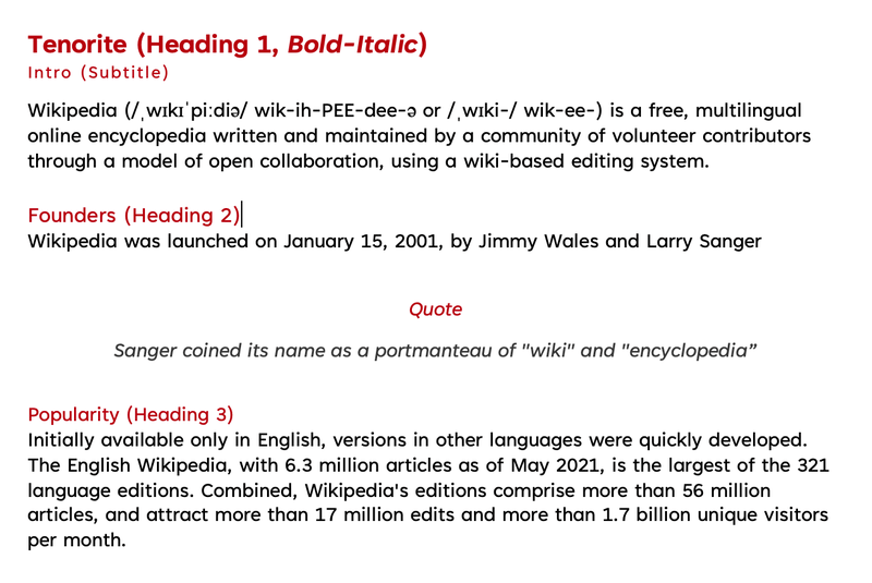
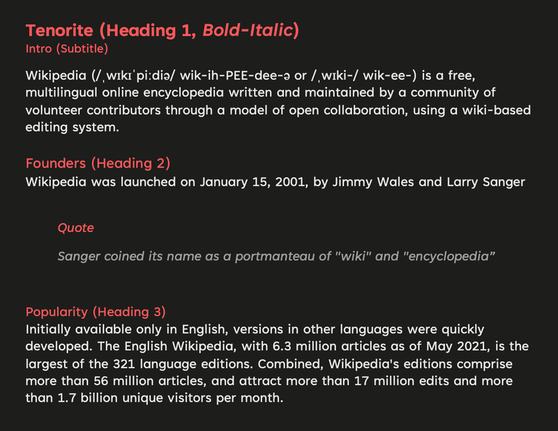
TENORITE by Erin McLaughlin and Wei Huang
Erin and Wei: After years of Calibri—known for soft corners and narrow proportions—we were craving something very round, wide, and crisp, and the geometric genre felt like the right direction.
We both love the circular forms and sturdiness of Adrian Frutiger’s Avenir. But because customers read and write long paragraphs of text within applications like Microsoft Word, more generous character spacing is helpful. The Tenorite fonts aim to solve this problem.
The display styles of Tenorite, however, are much narrower and inspired by Trade Gothic. This tighter fitting allows for more words to fit on a line, which is great for use in PowerPoint presentations, and in all-caps settings when creating column headings in Excel spreadsheets, for example. The Tenorite Display weights are also a bit thinner and heavier than their Tenorite counterparts, giving the family more versatility.
Tenorite’s punctuation was particularly fun to create, and we didn’t shy away from going large and circular. In many typefaces, the punctuation is too faint, tightly spaced, or easily confusable for on-screen rendering, where clarity is key.
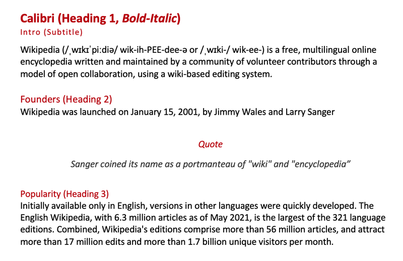
For reference, here are other popular fonts
Calibri
Helvetica Neue
San Francisco Pro
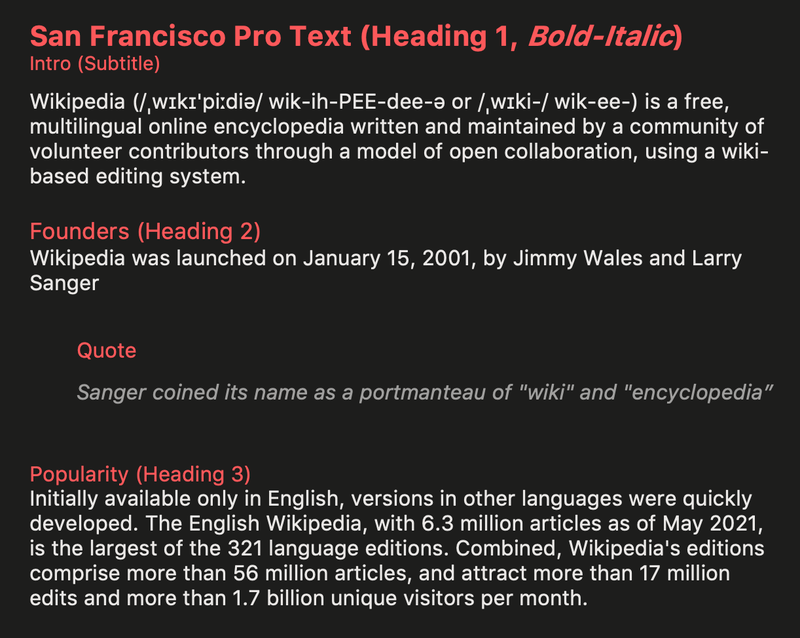
Direct Comparisons
Here are a couple of comparisons with some of the specific differences close-up. For more comparisons, open up the images above in separate tabs and switch between the tabs.
Happy typing! See ya next time.
Contact
Reach out if you have any questions! Feel free to follow me on
- Twitter - @singhkays
- LinkedIn - https://www.linkedin.com/in/singhkays/
